Recreating the Divi Landing Page with Animated Call to Action Button & Play Button
Welcome back for part two of our two part series on recreating the top section of the Divi landing page by Elegant Themes. In part one of this series, we showed you how to recreate Elegant Themes’ popup video with call to action button in Divi using our plugin Divi Overlays. And we gave a way the popup overlay layout for all Divi Overlays customers.
In today’s tutorial, we’re going to be recreating the section with the animated play button on hover, as well as the animated call to action button. And of course, we’ll be giving away the layout for you to download and install. 🙂
Take a look at the demo of what we’ll be creating by clicking on the button below!
Let’s get started!
Adding the Sections, Rows, & Modules
The first thing we’re going to want to do is create a new section, with a 1/2 1/2 column layout. Then, on the left column, insert a code module. This is where we’re going to insert the image. The reason we’re using a code module instead of the image module is we need to be able to add the HTML for the play button, and it’s much more difficult to do that with the image module.
Now, here’s what you need to insert into the code module:
Image + Play Button
<a id="overlay_unique_id_27331" class="popup-youtube et-gallery-video et-gallery-video--block">
 <div class="et-gallery-video__button"></div><img alt="Watch The Video" src="/wp-content/uploads/2017/10/1.jpg"></a>
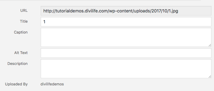
Okay a couple things about the above code. You’ll notice that the image is src=”/wp-content/uploads/2017/10/1.jpg” which is a “relative” link path. You’ll need to download the image here, or use your own image instead. Once you download the image, go to your media library, and upload. Then, copy the URL (shown below), and replace the relative URL in the your code module with the URL of the image on your own website.

Okay, the next step is to add a Text Module to the right column of your layout. You can add the below text, or, add your own text instead:
Divi. The Ultimate WordPress Theme and Visual Page Builder
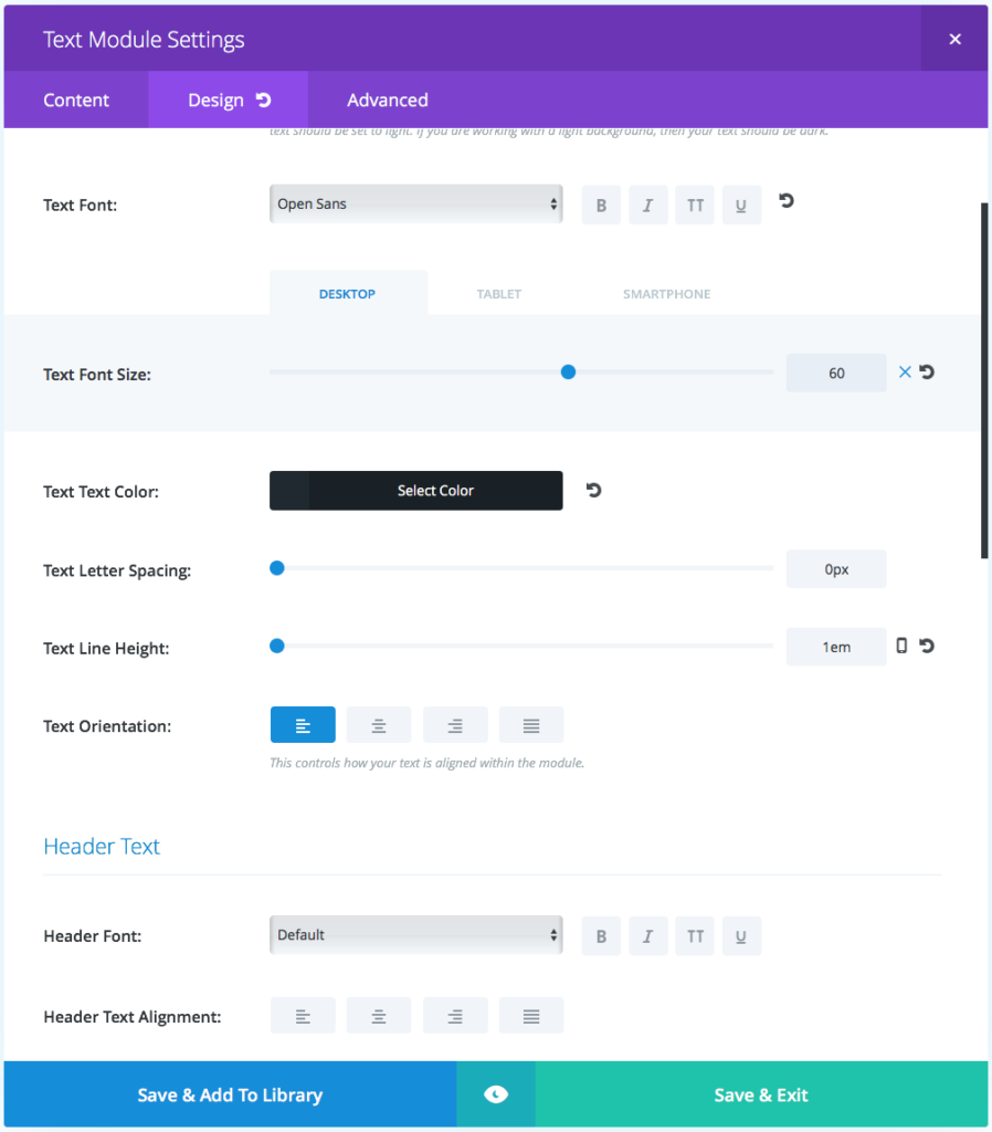
In order to get the styling the way we want. Navigate to the Design tab and make the following changes:
- Text Font: Open Sans
- Text Font Size:
- Desktop: 60
- Tablet: 42
- Mobile 42
- Text Text Color: #20292f
- Text Letter Spacing: 0px
- Text Line Height: 1em
- Custom Margin:
- Top: -10px
- Custom Padding:
- Top: 0px

Once you’ve made those changes in the design tab, you can go ahead and click save.
The next step is to add the button module below the text module in the right column. For the button text, you can add whatever you like, but to match the Divi page we added: Try it For Free
The Button URL can point to any page you want.
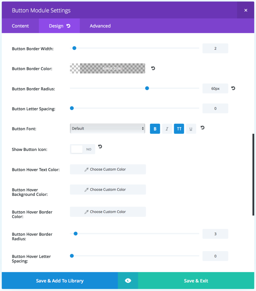
The next step is to click over to the Design tab of the module, and turn on the “Use Custom Styles for Button.” Here’s the settings we to change:
- Button Text Size: 15
- Button Text Color: #ffffff
- Button Border Width: 2
- Button Border Color: rgba(0,0,0,0)
- Button Border Radius: 60px
- Button Font: (click the B and TT icons for Bold and Uppercase)
- Show Button Icon: No
- Custom Padding:
- Top: 20px
- Right: 40px
- Bottom: 20px
- Left: 40px

You’ll notice we didn’t touch some of the settings such as background color. This is because we’ll control the background with CSS since it’s going to be animating.
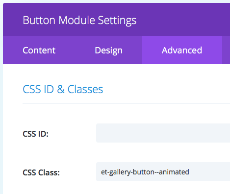
The lat thing we need to do in the button module is add the following to the CSS Class filed in the Advanced tab: et-gallery-button–animated

The above step is VERY important! Without it, the button will not animate :)
Adding the Custom CSS
Okay now that the modules are all set up with the content and settings configured, it’s time to add the custom CSS.
So you have several options of where to put the below CSS.
- Copy and Paste it into the stylesheet of a child theme
- Copy and Paste it into the custom CSS box in Divi > Divi Theme Options (recommended for beginners)
- Copy and paste it into a code module within the layout between two style tags: <style> </style>
Custom CSS
.et-gallery-section--main .et-gallery-video {
background: #414b56;
box-shadow: 0 10px 10px rgba(0,0,0,0.1);
}

.et-gallery-video--block {
display: block;
 }

.et-gallery-video__button, .et-gallery-video__button:before {
 -webkit-transition: all .4s ease;
 transition: all .4s ease;
}

.et-gallery-video__button {
 z-index: 2;
position: absolute;
 top: 50%;
left: 50%;
background: rgba(255,255,255,0.8);
width: 60px;
height: 60px;
border-radius: 100%;
-webkit-transform: translate(-50%, -50%);
transform: translate(-50%, -50%);
box-shadow: 0 10px 30px rgba(0,0,0,0.3);
}

 .et-gallery-video__button:before {
content: '';
position: absolute;
top: 50%;
left: 50%;
display: block;
width: 0;
height: 0;
 border-top: 10px solid transparent;
border-right: 10px solid transparent;
border-bottom: 10px solid transparent;
border-left: 10px solid #4C5867;
-webkit-transform: translate(-15%, -50%);
transform: translate(-15%, -50%);
}

 .et-gallery-video:hover .et-gallery-video__button {
background: #ba4cff;
width: 80px;
height: 80px;
box-shadow: 0 15px 40px rgba(0,0,0,.5);
}

 .et-gallery-video:hover .et-gallery-video__button:before {
border-left: 10px solid #fff;
}

 #overlay-26826 .overlay-close {
background-color: black;
z-index: 100;
border: 8px solid black; border-radius: 30px;
}

 #overlay26826 .et_pb_code {
max-width: 900px;
margin-left: auto;
margin-right: auto;
margin-top: 5%;
}

.divi-join-button {
padding: 0 10%;
z-index: 9999999;
bottom: 5%;
left: 0;
right: 0;
position: fixed;
text-align: center;
}

.divi-join-button a {
display: inline-block;
background: #7e3bd0;
text-decoration: none!important;
color: #fff;
font-size: 1.5rem;
padding: 20px 40px;
box-shadow: 0 10px 30px rgba(0,0,0,.1);
border-radius: 60px;
}

.et-gallery-button--animated {
-webkit-animation: divi-button 6s ease infinite;
animation: divi-button 6s ease infinite;
}

.divi-join-button a:hover {
background: #964df1;
}

@-webkit-keyframes divi-button{
0% {
background: #7E3BD0;
-webkit-transform: scale(1);
transform: scale(1);
}
33% {
background: #c73bd0;
-webkit-transform: scale(1);
transform: scale(1);
}
 40% {
-webkit-transform: scale(1.1);
transform: scale(1.1);
}
47% {
-webkit-transform: scale(1);
transform: scale(1);
}
 66% {
 background: #3bd0c9;
-webkit-transform: scale(1);
transform: scale(1);
}
100% {
background: #7E3BD0;
}
Aright that’s it! You should now have a layout section that looks almost identical to the Divi landing page top section, complete with the “growing” play button on hover, and the animated call to action button that changes background colors and “hops” every few seconds to grab attention.
But I imagine you’ll probably want to customize it a bit to match your own colors right?
So to customize the colors of the animated call to action button, simply change the background colors shown in this part of the CSS:
@-webkit-keyframes divi-button{
0% {
background: #7E3BD0;
-webkit-transform: scale(1);
transform: scale(1);
}
33% {
background: #c73bd0;
-webkit-transform: scale(1);
transform: scale(1);
}
40% {
-webkit-transform: scale(1.1);
transform: scale(1.1);
}
47% {
-webkit-transform: scale(1);
transform: scale(1);
}
66% {
background: #3bd0c9;
-webkit-transform: scale(1);
transform: scale(1);
}
100% {
background: #7E3BD0;
}
The keyframes show the progression of the animation, and the styling that corresponds to that part of the animation progression. So at the very end of the animation (100%) the background color is #7E3BD0.
Okay we’re done! Do you want to download the layout? Just click the button below. The video embedded above shows you how to import the layout (and customize it).

Great tutorial. Thanks Tim!
Glad you like it, Maciej! 🙂
Fantastic Tim.
Did i miss how to add the close icon (X) top-right of the video?
Tutorial example can also be closed by clicking outside the actual video.
Is this possible with any overlay popup?
Great tutorial.
Hey Paul!
Did you take a look at part one? If not, I recommend checking it out 🙂
https://divilife.com/how-to-create-pop-up-video-in-divi-with-call-to-action-button-using-divi-overlays/
Part one talks about the custom close button, and then you can also install the video layout and take a look at it for yourself. And yes, clicking the background will close any overlay. Sometimes the padding from the row will keep this from happening, but if you add the custom class close-divi-overlay to the section then that will fix it. Adding that class is also how you create custom close buttons. 🙂
This helps a lot, thank you! One thing that wasn’t covered but would be interesting to hear more about is where the play button comes from and how to customize it (color, size, location etc)
Hi Keith,
The play button is created with CSS, and can be customized the same way. For example, below is the CSS that generated the play button, so you can customize it accordingly:
.et-gallery-video__button:before {
content: ”;
position: absolute;
top: 50%;
left: 50%;
display: block;
width: 0;
height: 0;
border-top: 10px solid transparent;
border-right: 10px solid transparent;
border-bottom: 10px solid transparent;
border-left: 10px solid #4C5867;
-webkit-transform: translate(-15%, -50%);
transform: translate(-15%, -50%);
}
How can I add the rounded light purple shadows around the play button like Elegant Themes does?
It’s just some CSS that needs to be added to the code. You could inspect element in your browser on their button and then copy the custom CSS to your own 🙂